Listed on the National Register both individually and as part of the Downtown Brookhaven Historic District, the Brookhaven Post Office is an impressive building. It’s also surrounded by impressive buildings, including the First Methodist Church and the Whitworth College campus (now Mississippi School for the Arts) across the street. In fact, I think the corner of Cherokee and Jackson streets is one of the finest corners in small-town Mississippi. Don’t disagree with me until you’ve stood there yourself.
Here’s what the MDAH Historic Resources Database has to say about the Post Office and its interesting mixture of styles.
Built in 1912, the Post Office is a unique building in Brookhaven. No other structure in the town embodies the characteristics of the Beaux Arts, Italian Renaissance, and Mission styles. Constructed by the Treasury Department, the Post Office was designed by James Knox Taylor (Chief Architect) and Louis A. Simon (Supervising Architect). Because very few post offices were built in Mississippi during this period, the designs attributed to James Knox Taylor are very rare in the state. The building is located across the street from Whitworth College, Mississippi’s first women’s and third oldest college, which together with the post office forms the town’s most architecturally significant group of institutional buildings.
Let’s head inside and see whether it meets the standard set by the exterior. First we encounter an arcaded porch, not as deep as a “real” porch, this one is more for dramatic effect and provides extra cover in inclement weather.
Stepping inside, we find a large airy space full of light, white-painted plaster, arches, a coffered ceiling, and bustle (although I waited for people to get out of my pictures, I had to wait quite a while in some instances, not to say glaring at people to move). There’s a pleasant absence of color, except in the post office boxes themselves, a light-colored marble wainscot, and the black-and-white terrazzo floor. And of course the garishly blue plastic recycling bins.
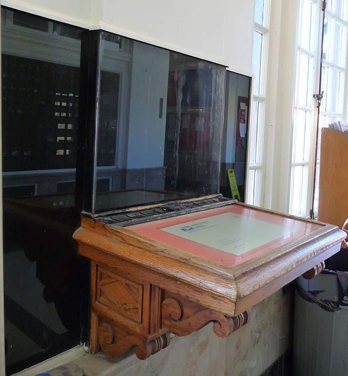
As far as I could tell, the interior (at least the lobby) retains pretty much all its original hardware, light fixtures, and furniture including this sweet wood writing table. Not sure if that clock is original, but it seems to fit pretty well into the round space.
Here are a few more details of the interior. Next time you’re driving down I-55 down in this part of the state, swing off into downtown Brookhaven, have a look around, and step inside the post office. You’ll be glad you did!
Categories: Architectural Research, Brookhaven, Post Offices


OH MY GOODNESS!!! This is gorgeous! Thank you so much for letting us see.
LikeLike
My sentiments as well. And the photography is exceptional as well!
LikeLike
What a BEAUTIFUL old Post Office building.
I’m sure this qualifies it for government funding, that will allow it to be knocked down and rebuilt, with concrete blocks and enery effecient windows….lets get moving on it!!!
LikeLike
I wish I had taken the time to actually see the town of Brookhaven. Sadly, we were usually in too much of a hurry to race up to Jackson on I-55. Taking the time to stop and see a place is usually well worth the effort.
LikeLike
Thank you for sharing.
LikeLike
It is a beautiful building with great details. I find it weird on the last photo, though. At glance, the first thing that registers in my brain is that there is a series of four “KKK” across the door. When I focus, it is clear that there is a diamond shape that stands out in the foreground and causes the lines to recede, but the first visual makes the lines prominent and in the shape of a K. That is one of those interesting things–to me–about what messages buildings send that may not have been intentional. Or then, it could just be me, because I see designs in my shower tile, too.
LikeLike
Weird, I didn’t see that at all until you mentioned it. I do see designs in all tile floors though, may be borderline OCD? :-)
LikeLike
Where in the world did you get KKK out of these triangles????
LikeLike
Some people can make something out of nothing. Clearly not KKK. Triangle at the top and triangle at the bottom. Clearly not KKK.
LikeLike
Same on the writing desk as you enter the post Office door next to Methodist Church. Did you not notice that? Same design as on the top of the exit door as you exit the . building. Look closer or do you need glasses or new glasses. I do not know what the design stands for but it is definitely not KKK. I will research and see where the design is coming from. Takes a sad mind to try to make something out of nothing Go back and take a closer look at both designs.
LikeLike
Also on the floor of one space. The design is predominant thru out the building. On the floor of the brick wall. Looks like an outside wall. Not sure where this floor is. Will take a look next time I go there.
LikeLike
I grew up running through that post office. Yeah, it’s you. Maybe see a head doctor.
LikeLike
Who would have thought all those years ago, all those trips to the post office, would have been trips to such a beautiful, historic building? There is so much detail and beautiful craftsmanship here. It definitely is one beautiful building for sure!
LikeLike
Where are the windows where the postal clerks worked? I remember them being in the lobby, but I don’t see them in these pictures.
LikeLike