Yesterday’s post about the new federal courthouse got me thinking about courthouses and government buildings, and as it happens, another court building–this one for the Mississippi State Supreme Court–is also almost complete after a number of years of construction and provides an interesting counterpoint to the federal courthouse.
Standing just across High Street in downtown Jackson, facing the New Capitol from the north, is the new Carroll Gartin Justice Building. Actually, it should be called Gartin Jr. because it replaces the first Gartin Building, which had stood on this location since its completion in 1973. I’m not here to argue that the original should have been preserved. I didn’t hate the building, but I can see how its New Formalist style might have been more abstractly classical than people then or now wanted to see. Besides that, anecdotal evidence indicates it was leaky and moldy and cramped. It was definitely in need of better maintenance, as most state-owned buildings are. Even so, I thought it was a handsome structure and well-proportioned.
Anyway, Sr. was torn down around 2009, after the large back section of Jr. had already been built and occupied in 2008. The new building sits much farther back off the street than the old one did, so once all the users moved out of Sr. into the back part of Jr., the primary construction left to be done was to renovate the two floors under the plaza, and add the entrance area and the portico.
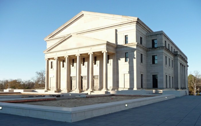
As you can see, the new Supreme Court building is much more traditionally classical than the old one. It looks like a Greek temple, and from the depths of our history, our forefathers have built government buildings that showed the relationship between our system of democracy and law and the civilizations of Greece and Rome. This was by design, as noted by Chief Justice Smith in a Mississippi Lawyer article (March-April 2008–you can also see some good interior pictures in this issue, along with a view from the rear, which is quite impressive):
But what we wanted was a courthouse design of understated elegance built to better serve the public and withstand the rav- ages of time. We wanted a design that was dignified but not extravagant. We wanted traditional design that complements the architecture of the Capitol inside and out. Anyone familiar with the old Supreme Court chambers at the Capitol will recog- nize the repeating design element the moment they walk into our new En Banc courtroom.
So, unlike the new federal courthouse, symbolism and tradition were a part of this design from the beginning, and it shows.
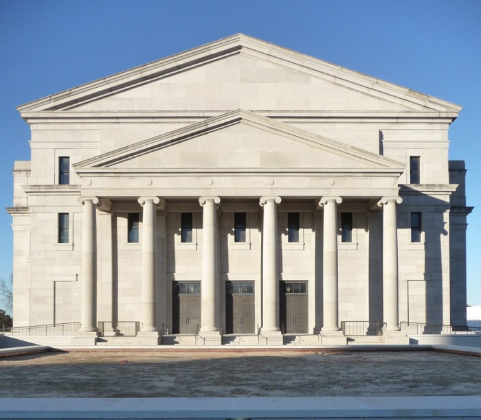
Proportion is an especially important aspect of classical architecture, and I think the new building also has excellent proportions in every respect except one. Unfortunately it’s kind of an important one since it’s right on the front. Usually my complaints about strange proportions in new classical architecture have to do with Americans’ belief in “bigger is better.” That is, whenever proportion is off, it’s usually because some piece of the puzzle is too big, and it throws everything off. In Gartin Jr. though, I believe the portico that they’ve attached to the otherwise nicely proportioned building is too small.
 To the right is how you normally see a portico attached to a temple-fronted building. See how the portico is almost as tall as the building behind it? See how the frontispiece (that cast-concrete horizontal line) of the main building continues around the bottom of the portico to pull everything together, kind of like a tie with a nice suit? Now compare that with the Gartin building’s portico above (or click here to pull up the picture in a new window): the portico comes only to the bottom of the pedimented gable behind it, and if you look closely (sorry about that winter sun glare), you can see that there’s a strange rectangular piece that rises between the portico and the building behind it to somewhat finish the front off. This piece is fairly awkward, and it’s actually what first got me thinking about the portico–it wouldn’t be necessary if the portico had been properly proportioned. Notice also that while the cornice of the main building carries through the portico, there is no heavier frontispiece to carry through and give a nice line for your eye to follow all the way around the building. This isn’t a deal breaker kind of thing, but it’s the difference between high- and moderate-quality classical design.
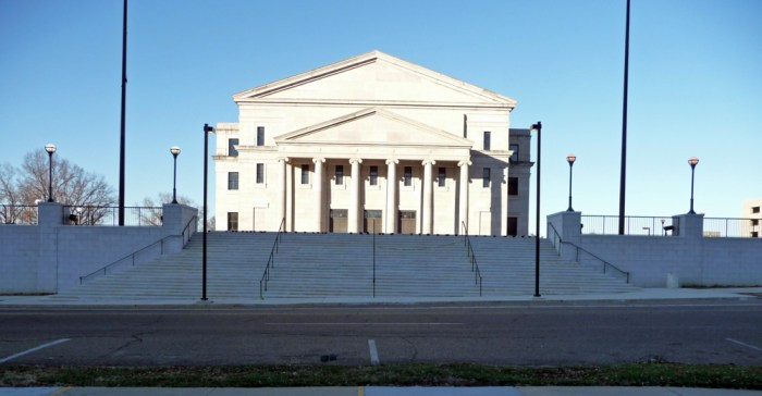
Here’s another thing that’s a little more problematic in my mind, since it distorts the view of the building to almost every passerby: the way the staircase leading up to the plaza was handled.

This is the view of the Gartin Building from across High Street, standing in front of the New Capitol
Oh whoops! What happened to the bottom of the building? Well, it got swallowed up in a staircase that rises too steeply from the street to a very deep plaza in front of the building. This is odd, because as you can see in the photo of Gartin Sr. above, the older building was much closer to the street, and yet the base on which it sat was handled in such a way that the building was still fully visible from the street. If the stairs had been lengthened, whether with a series of terraces as at the New Capitol, or even better, using the steps and intervening terraces to create a grand parade up to the building, like at the U.S. Supreme Court in Washington DC, the building’s presence would have been heightened and its imposing facade would have been fully visible. I assume that the presence of the underground space must have limited flexibility on the stairs, but all I know for sure is the final result, and that is that the building looks strangely truncated from the street.
Of the two buildings, Carroll Gartin and the new federal courthouse, my vote is definitely with the Gartin Building. I just wish these details had been dealt with more elegantly in the design so that the building could really shine.
Ok, that’s it for my foray into architectural criticism. Let the brickbats begin to fly!
Categories: Courthouses, Jackson


No No No…. keep going!… seriously,.. this critique is so needed…. The exact details you are pointing out is the hard work of properly proportioning and detailing these public spaces,… especially in Classical facades like these, proportion is EVERYTHING… and tying back into your marrying of current design to the judicial/social zeitgeist, perhaps this close-but-not-quite design is, again, reflecting back on what we as a community are experiencing/expecting?…. great discussion.
LikeLike
I remember the debate over whether the first Gartin building should have been more grand than it was. The cheaper looking version of that building won the day though. However, in the long run the cost of constructing a building the judges wanted cost the state even more. There certainly should be more than 36 years of life in any building.
LikeLike
No, don’t stop, a great critique, I think we in the profession are way too shy about offering constructive criticism.
Just give it 40 years, they’ll tear it down and build another one with a “…design of understated elegance built to better serve the public and withstand the ravages of time…”
LikeLike
To a layman like myself, the new building looks 1000 times better than the old 1970’s building. The 70’s were truly a terrible time for Jackson architecture.
LikeLike
I wouldn’t say 1000, but I see your point . . . Thalia Mara Hall is a better example of New Formalism, and just a generally more impressive building than Gartin Sr., but it was finished, I think in the 60s, so I hope evades your disparagement of the entire 70s decade. :-)
Enjoyed being introduced to your blog, btw!
LikeLike
Finally, some improvement in Mississippi architecture after over 60 years of architectural decline. Take that you Modernists!
Malvaney, I disagree with you on the portico’s proportion and its overall effect. The portico is the right size, monumental yet without overwhelming the building. The courthouse’s portico does not overwhelm the rest of the building. If the portico was larger, the courthouse would be overwhelmed by the portico; the pedimented gable would lose all of its monumental power, and the courthouse would merely be a structure attached to a portico.
Your church reference is an example of a building attached to the portico. Subtract the church steeple and my point is made. The steeple diminishes the portico’s overwhelming effect on the church; without the steeple, the church becomes a meetinghouse-style box attached to a portico that is too large, with columns out of proportion (too slender).
I agree that the plain, squarish area above the portico detracts from the overall design, but it is not a deal-breaker for the design’s success. The plaza’s stairs are a similar drawback, not a deal-breaker but not as serious a problem as you make it out to be. I think that the fact that the courthouse is on an incline, ruining the courthouse’s symmetry, is more of a problem than the staircase’s incline.
Hopefully this courthouse is here to stay since it is a far better building than the previous courthouse in every way. If only every Modernist structure could be replaced by such a beautiful, monumental example of Classicist architecture, the architecture of American Democracy.
LikeLike
I think it’s a mistake to think of “the building” separate from “the portico”–in a well-proportioned classical ensemble, both would be part of a larger whole. As it is now, the small size of the portico gives rise to that distinction; almost like an attached porch instead of an integral piece of the building.
The reason I had to use the church reference, actually, is that as I looked through my photo collection (which is pretty extensive), I realized that most of the temple-front buildings I had photos of actually had integral porticos on front, where the front gable actually extended in one piece all the way to the front of the portico–no step down at all–which is even larger than what this church example shows.
LikeLike
The larger upper pediment is just a bit too pompous to me. I’d prefer to see the portico scaled up a bit, as ELM suggests, and then a squaring-off of the attic behind/above it, as a nonstructural, “false front” wall that hides a smidge-scaled-down gabled roof line.
The play of the differing geometries and textures of the stone is lovely. Your photos definitely capture that. The National Gallery of Art in D.C. (1941?) is similar in this regard. Such subtle abstractions add just a faint hint of modernism to the design, suggesting that such qualities would not have been as likely to be emphasized in other Classical buildings from earlier times. I love Classicism as long as it’s ALIVE, and not suspended in formaldehyde. Styles don’t have to die out, but they have to continue having a pulse, and reflect something of the changed world they occupy, even if it’s just subtle touches.
The really unfortunate thing is the siting (head slowly shaking left to right, involuntarily). (Insert “Mr. Yuck” emoticon here;-) The view from High Street just breaks your heart.
LikeLike
Yah, the staircase and view from the street are simply incompetent. Reminded me of the fiasco of the Viceroy’s House in New Delhi.
LikeLike